It’s time for a new look!
You can’t see it if you are reading this in a feed reader, but if you are stopping by the blog itself, I feel a reassurance is in order. Dear readers, your eyes do not deceive you: this blog has a new look!
In three years of blogging, the Infinite Shelf has almost always had the same layout : 3 columns, with the banner, background and colors changing from time to time. I have played around with fonts and widgets for the sidebars, but it’s always been mostly the same.
Lately, I’ve started to feel a need for change. The Shelf felt crowded to me, and every time I looked at it there was just so much stuff! I wanted something cleaner, lighter, 2 columns with a minimum of information and design elements – without taking the completely minimalist route. I’ve been testing many designs but, until I accidentally tried this one for the French side of the blog (which I have recently revived), I hadn’t found one that worked so well for me! I like its simplicity, and I like that I will be able to feature photography in a much, much better way, either with galleries or with bigger pictures, something I couldn’t do before! It’s possible there will be even more change once I get my own domain and all, but for now I feel really, really good about this! 🙂
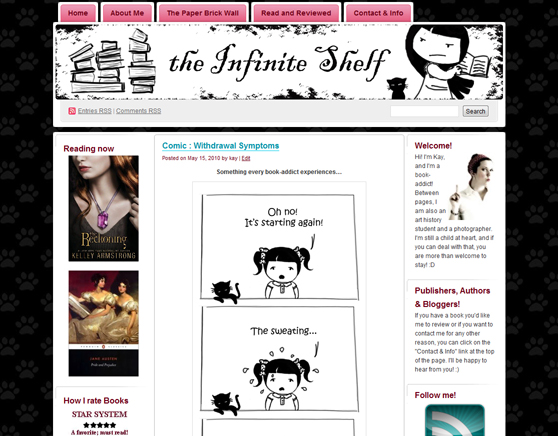
Just for fun, here are a few of the look’s I’ve had before (sadly I don’t have any pictures of the few layouts I had from January 2009 to the summer of 2009) :
Summer 2009 – May 2010
Where you can clearly see that I have always had a love for black and white monochrome and pink. This was also the introduction as comic-me in the banner! 🙂
* * *
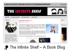
May 2010 – May 2011
I regret that I didn’t think of taking a larger screenshot of this one, since I had it and loved it for about a year!
* * *
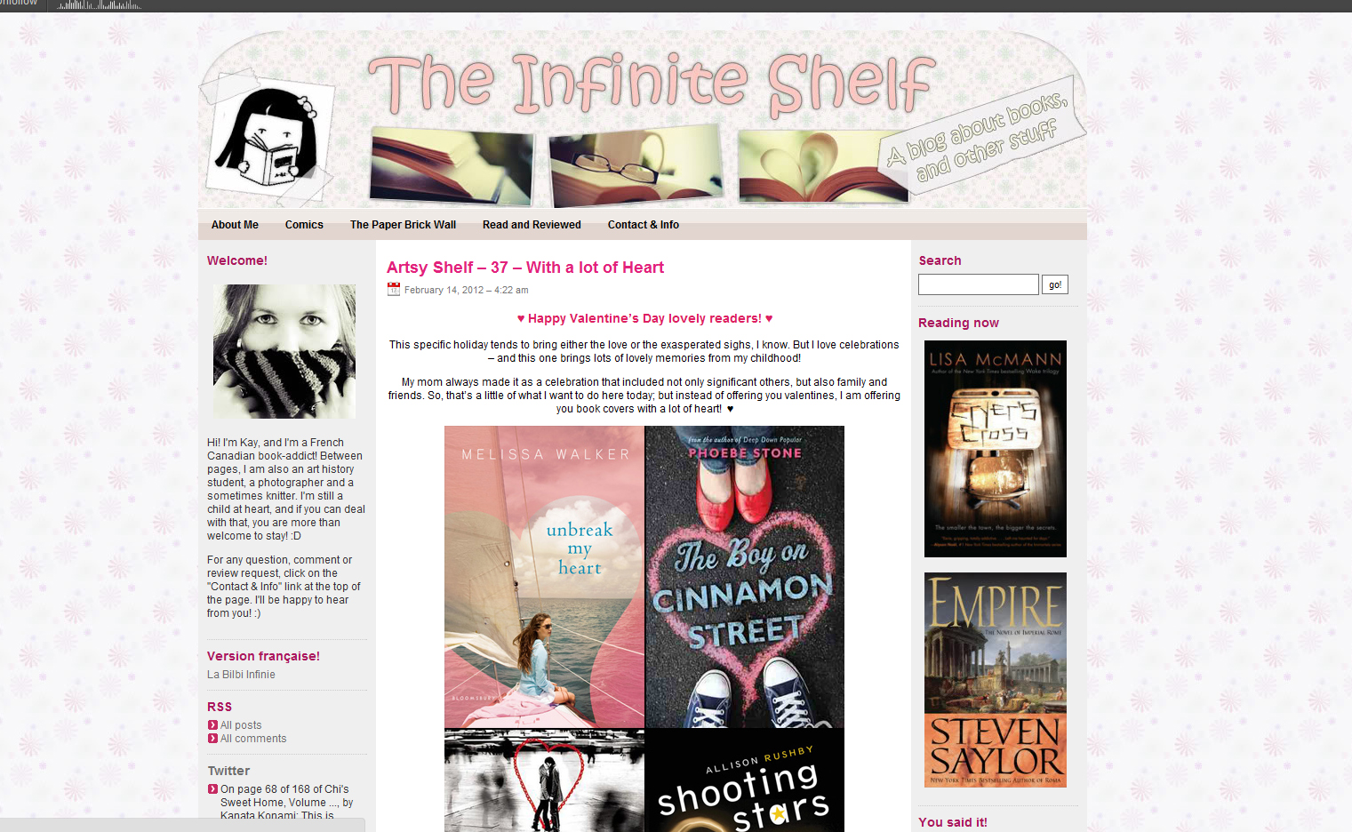
May 2011 – February 2012
This is the one you’ve come to know if you have visited here in the past few months. I have loved this one, but even good things must come to an end. It was time to try something new!
I feel that for the first time in years, I have made a really big change in this blog’s look. I really wanted something simple and clean, as neutral as possible so that pictures and reviews would “pop” more. I’m quite happy with it, and I will be tweaking it a little more to my liking in the coming weeks. I hope you guys will love it too! 🙂





Love your new lay out. I recently changed mine as well. It’s like starting a new school year…it’s exciting and new but your old friends are still around. 🙂
Thank you! I agree, it does feel like starting a new school year; what an excellent comparison!
I really like the new look! And I love that the banner incorporates both your photography and your comic self.
Thanks 🙂 I simply “monochromed” the old banner; I do think it explains a bit of who I am. Glad you like it!
It looks great! I wish I had your talent.
Thank you! I don’t want to take too much credit though; I only did the banner 🙂
I love that it looks cleaner but still the you we love and know.
Thank you Juju! I’m really happy you feel it still represents me, as I tried to do something that was really true to me.
This looks really great, I love it!
Thank you Kim! 🙂
Looks great!
Thank you! 😀
Very nice! I love the color scheme and “clean” look, and I can definitely relate to wanting a change. Even a small one does wonders for the soul!
Thank you Meg! It’s still surprising to me how simply changing a blog’s look can affect one’s happiness! It felt good cleaning up! 🙂
1. I LOVE IT.
2. Do you do this sort of things for other people?
1. Thank you! 😀
2. I never have, because my knowledge is honestly very limited when it comes to these things, sadly! I experiment and read tutorials; in the case of this specific design, the only thing I did was the banner. The design is freely offered by WordPress (Skeptical by Woo themes), and I haven’t personalized it much yet!
Love the clean look – I always worry that my blog looks too busy myself so I applaud you making the change!
I love it! The gray background works really well, I think.
The best thing about this post was that I hadn’t seen the new look yet, so reading was like building up the excitement to click over and see. 😀 Love it!
I love it! It’s so simple and clean, and it really does have a sophisticated air to it! Great job on this!
I really like it! It looks very clean, but not institutionally so. 🙂
I love the look of your new layout. Very inspiring and attractive. Good work. I am still on trainer wheels with mine, so have stayed with fairly generic style of layout, hopefully the content sparkles enough for a start.
In time, I will schmick it up, but for now, just happy to be in the chatterati and sharing fun and information across the world.
I like your new layout; good colors as well — very easy on old eyes like mine…LOL
This is my first visit but I tell you how I LURVE your refreshing look 😀 Great makeover.